Classrooms are looking like galleries as students' work is displayed on the walls. Exploring the elements of visual art - colour, shape, line, tone, texture, value, form, and pattern has been our learning focus. Art styles such as abstract, expressionism, geometric, pop, and realism have been investigated. Famous artists' work has also acted as an inspiration for our creations.
Students from across our team have put on their best thinking faces and reflected on making their creations and what elements they believe make them effective pieces of artwork.
Laurel Burch inspired cat calendar art in room 3
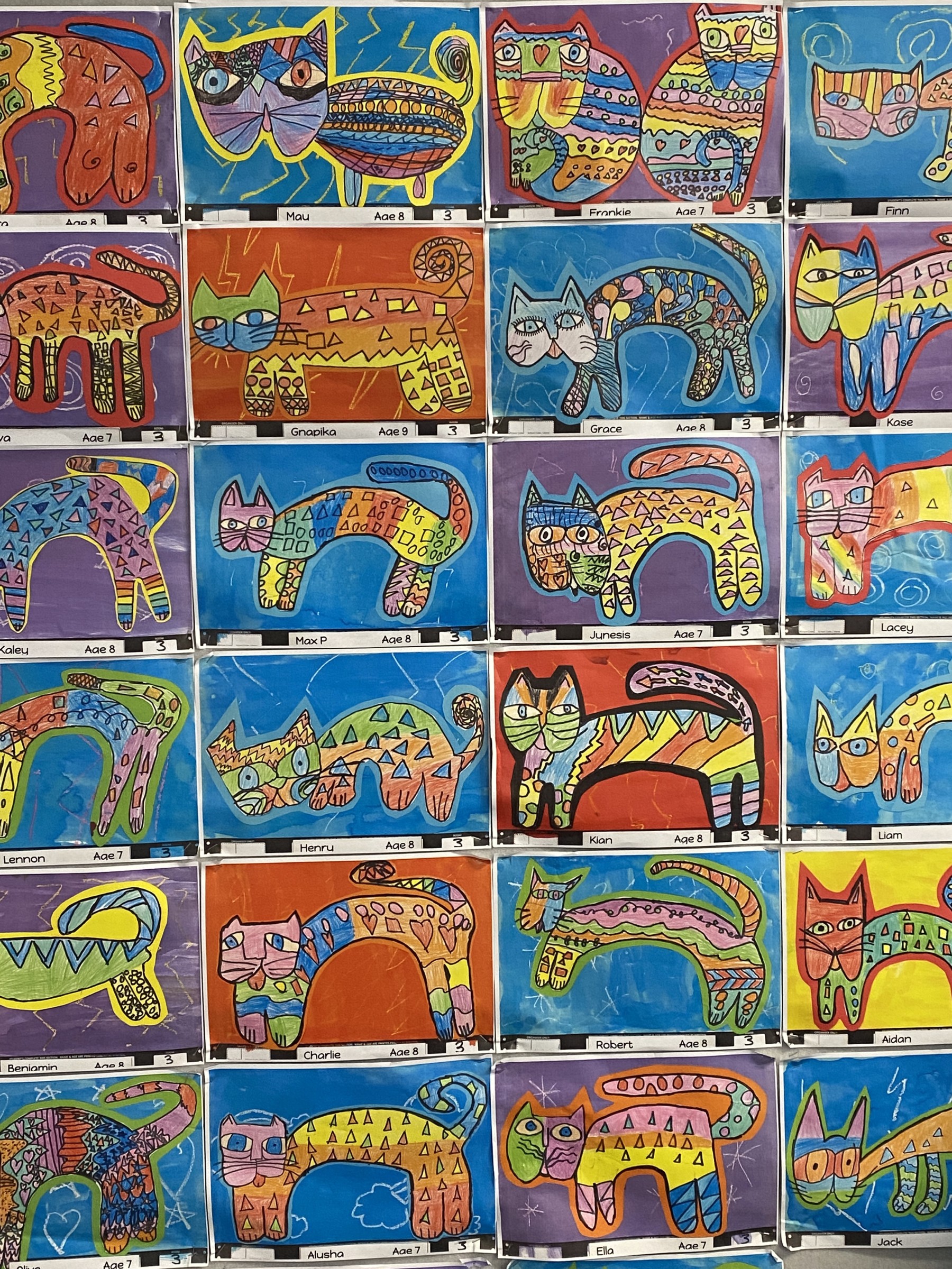
We learnt about the artist Laurel Burch who was famous for creating colourful and joyful cats. First, we had to practise drawing cats in her style. When we finally got good at drawing cats we could create our good copy. We used patterns and bright colour on our cats. Our cats look effective because they are all different. They have different patterns, bright colours - including warm and cool colours, and different backgrounds.
Stick people sculpture in room 2
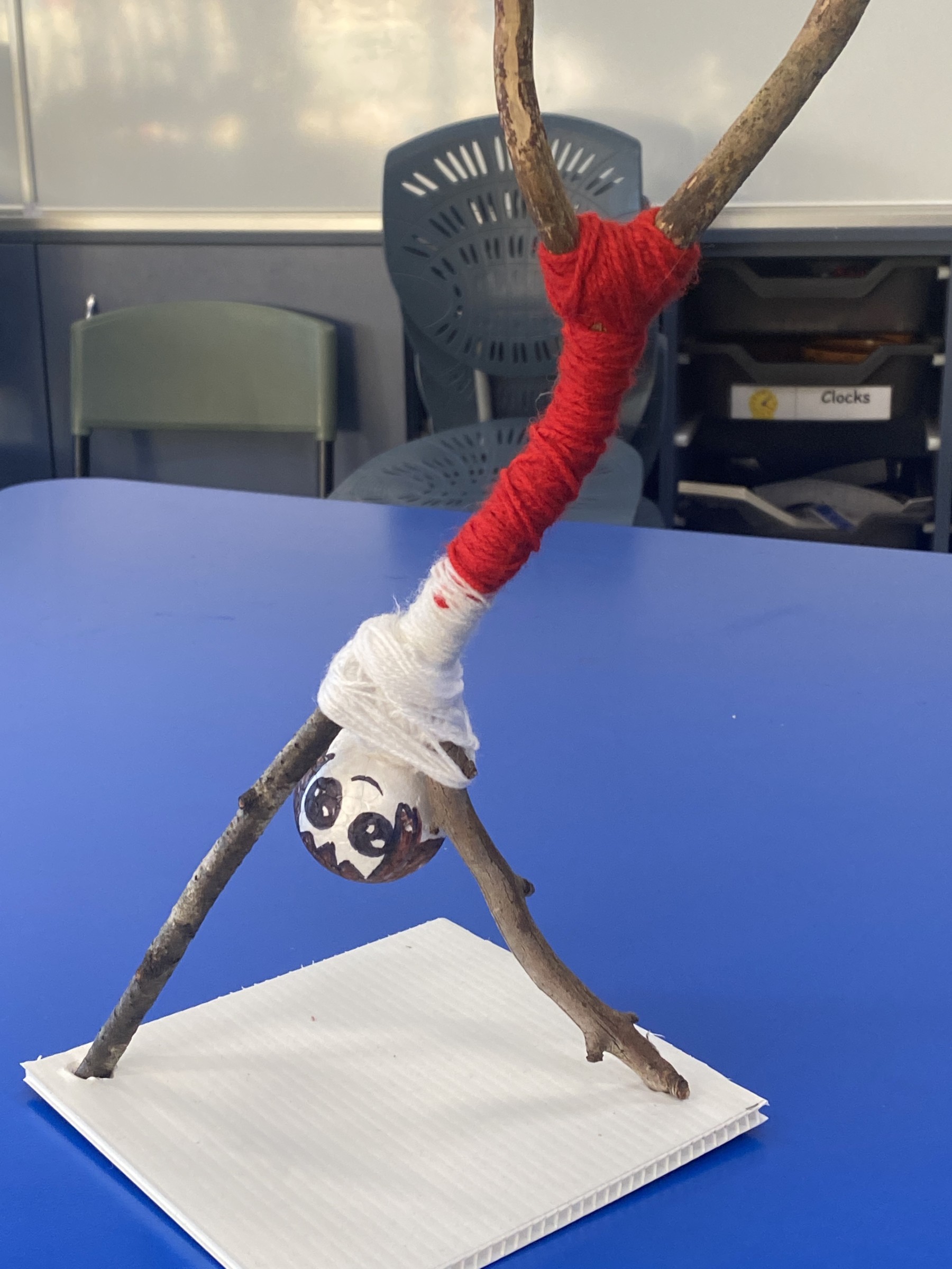
This is my sculpture called Linda. She is a gymnastics teacher. I used five sticks for her body and a styrofoam ball for her head. I wrapped the wool around her body to make clothes. I think the way I have positioned my sculpture doing a handstand makes it effective. I am going to put my sculpture on a high shelf in my bedroom so my dogs and brother won’t get it.
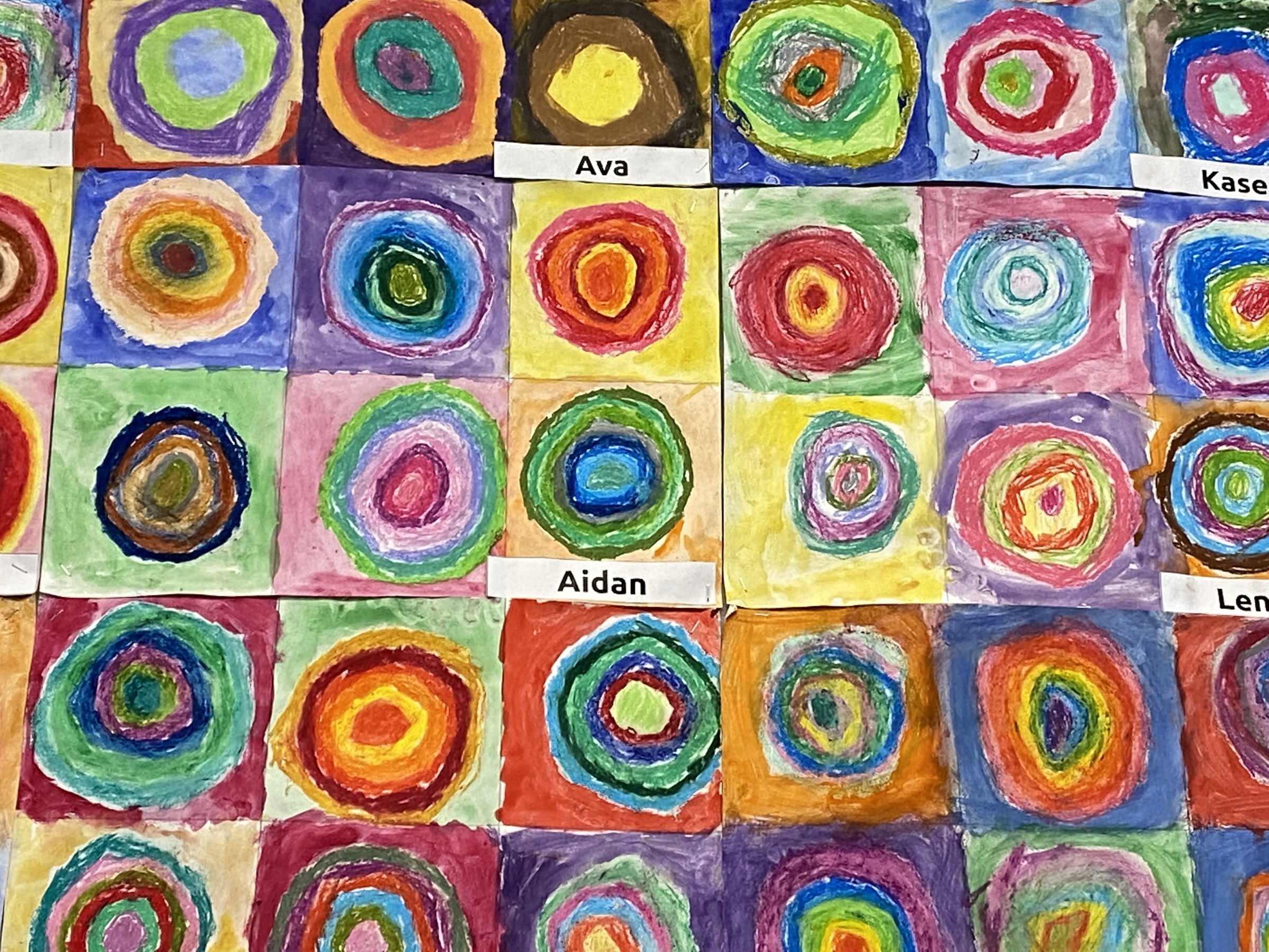
We used pastel colours to make the circles. We blended the colours in the circles together. We had to explore different ideas with colour, like using warm and cool colours. We use water colour paints for the background. We used real artist inspiration to make this creation. I think the way the circles are all put together to make a mural makes it look striking.
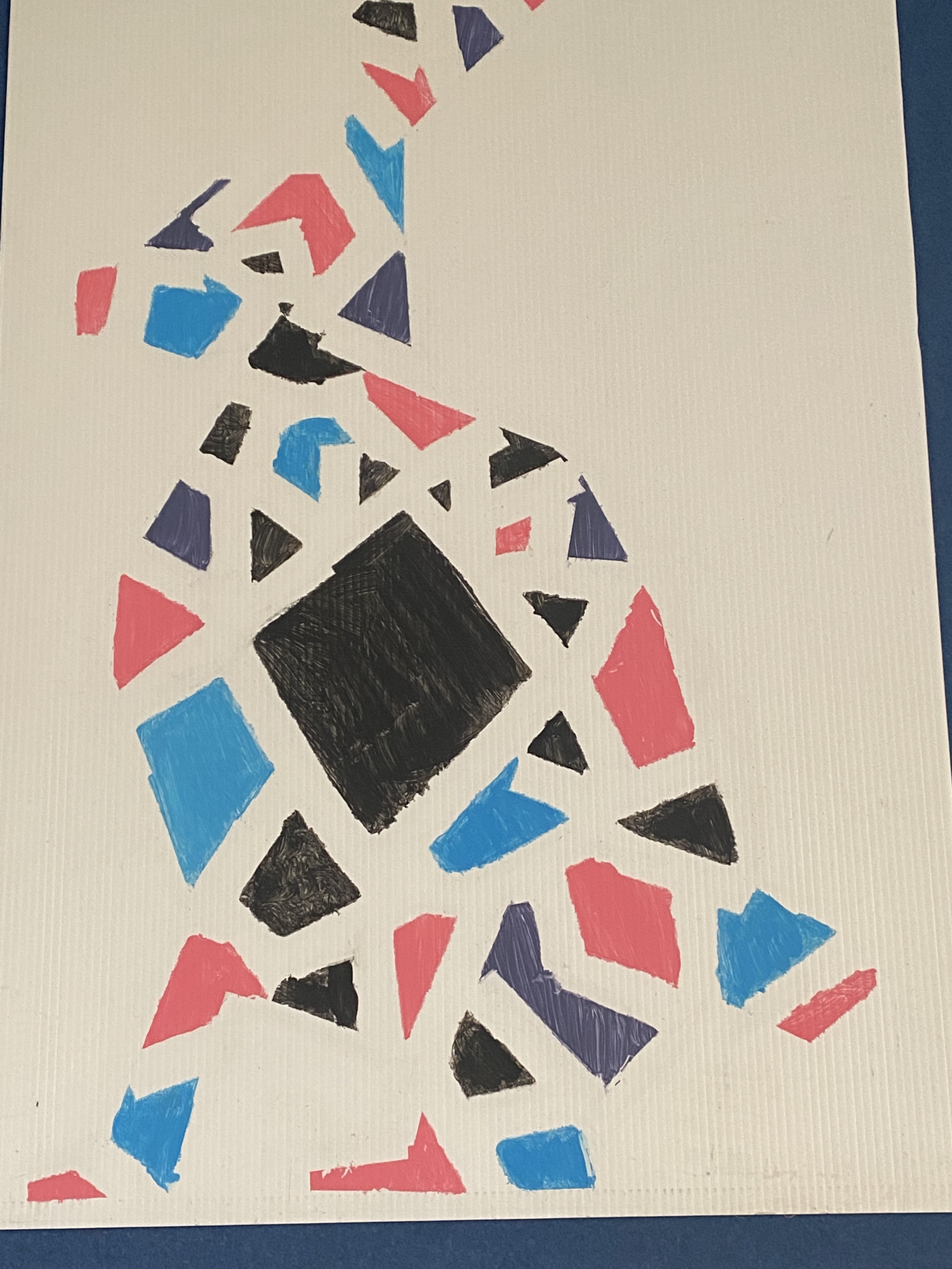
Shape art in room 2
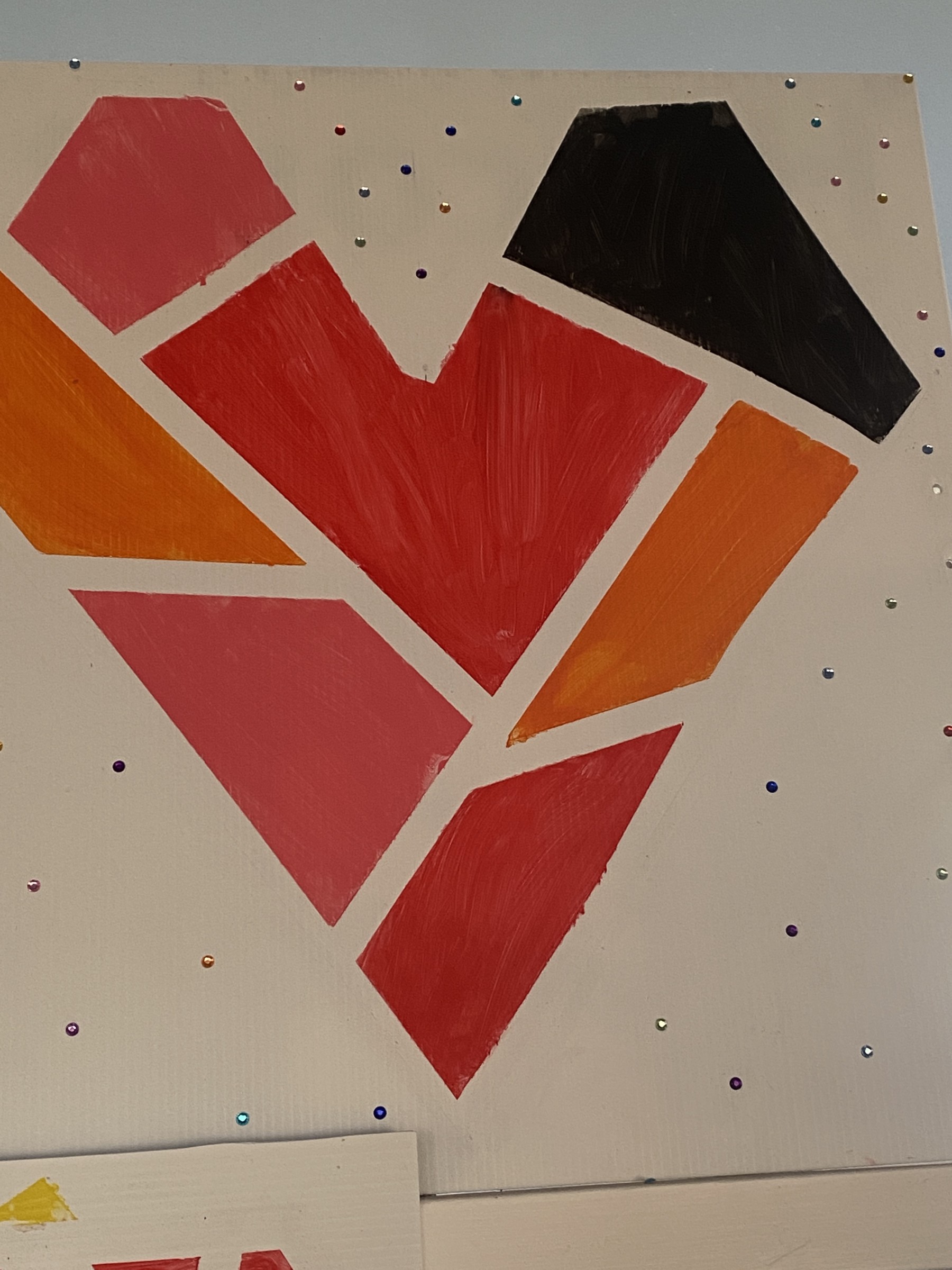
This is shape art. We drew the design with pencil then we rubbed it out. We used tape to make the different shapes. Each taped section we painted a different colour. We pulled the tape off while it was still wet. I like my sparkly background . I think my painting is big and bold and the heart takes up most of the space in the picture. It is not tiny, that makes it effective.
I first drew a picture of a rabbit. I chose to draw a rabbit because it is easy to draw. I chose the colours because I thought they would look good together. I like looking at the different shapes in the rabbit and purple is my favourite colour.
Paper line art in room 4
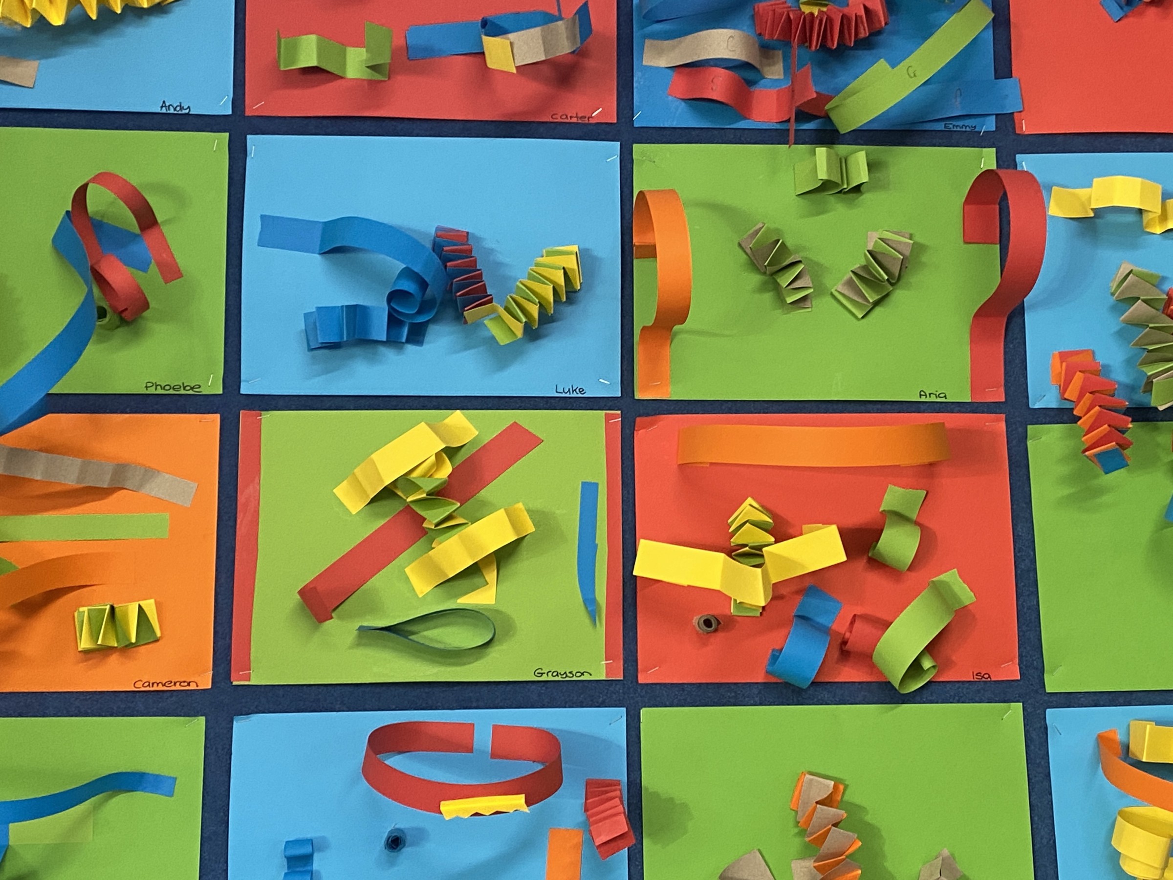

This is abstract art. We used coloured paper to symbolise our family. This art shows how effective art can be with just paper strips. We folded different coloured paper to make different designs with paper.
Watercolour paint and dyed background undersea calendar art in room 1
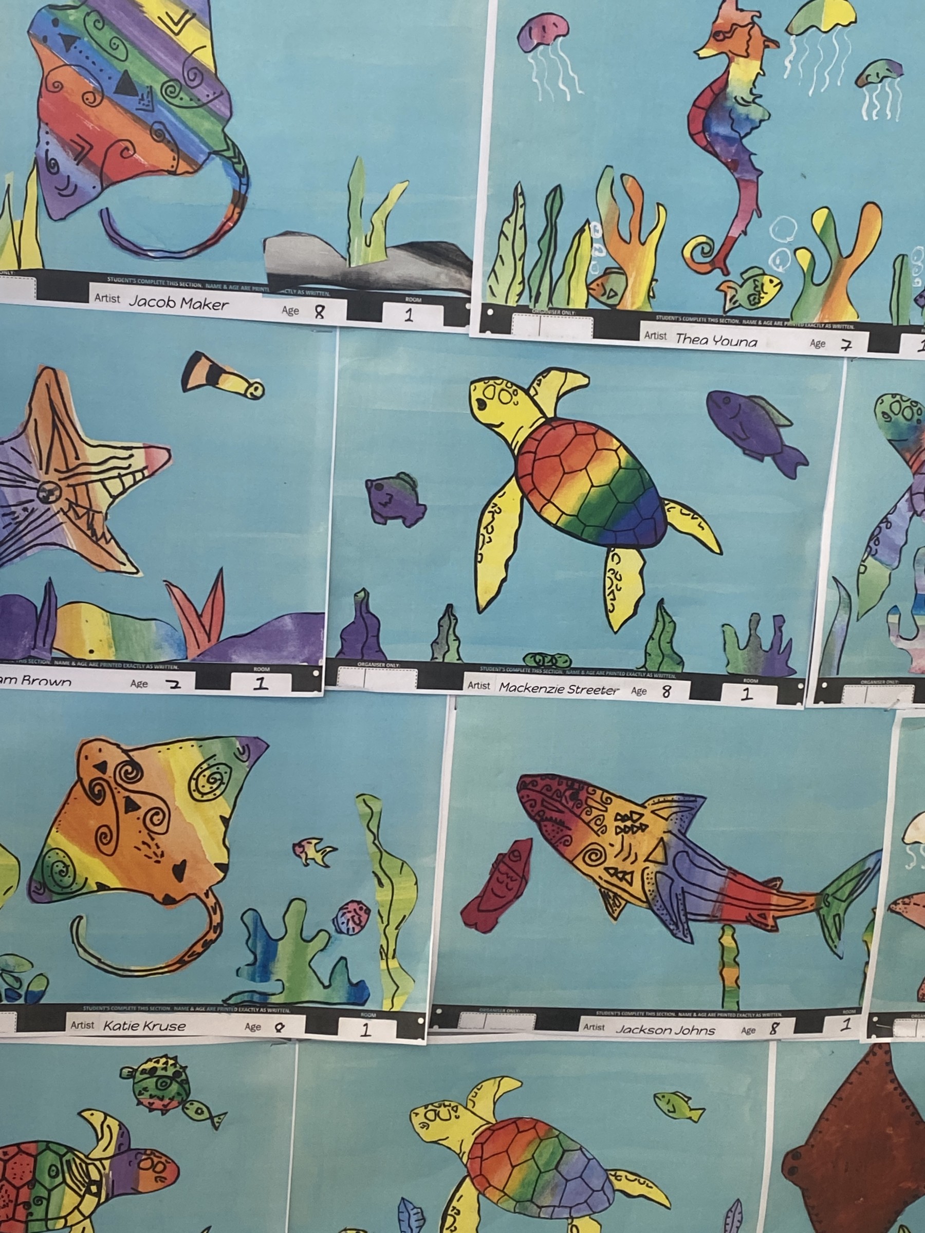
We traced our sea creatures. Then we painted the sea creatures and when they were dry we added patterns with a vivid. I think it is the bright colours of the sea creatures that makes our calendar art an effective piece of art. The coral pieces in the background also give the picture more interest.
Insect print making in room 4
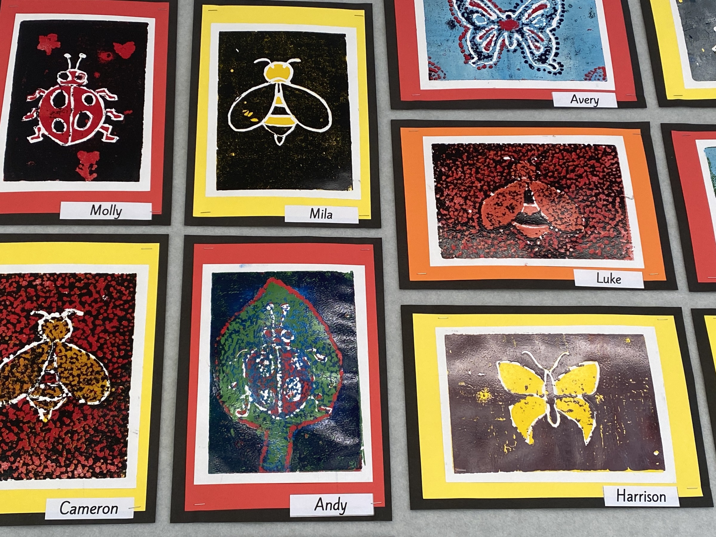
We had foam sheets and we had pictures of bugs. We used the handle of the paint brush to make the design in the foam. This art looks effective because there's lots of layers and textures. The frames make the artwork stand out because of the colours
Kandinsky circle and spatter art calendar art in Room 4
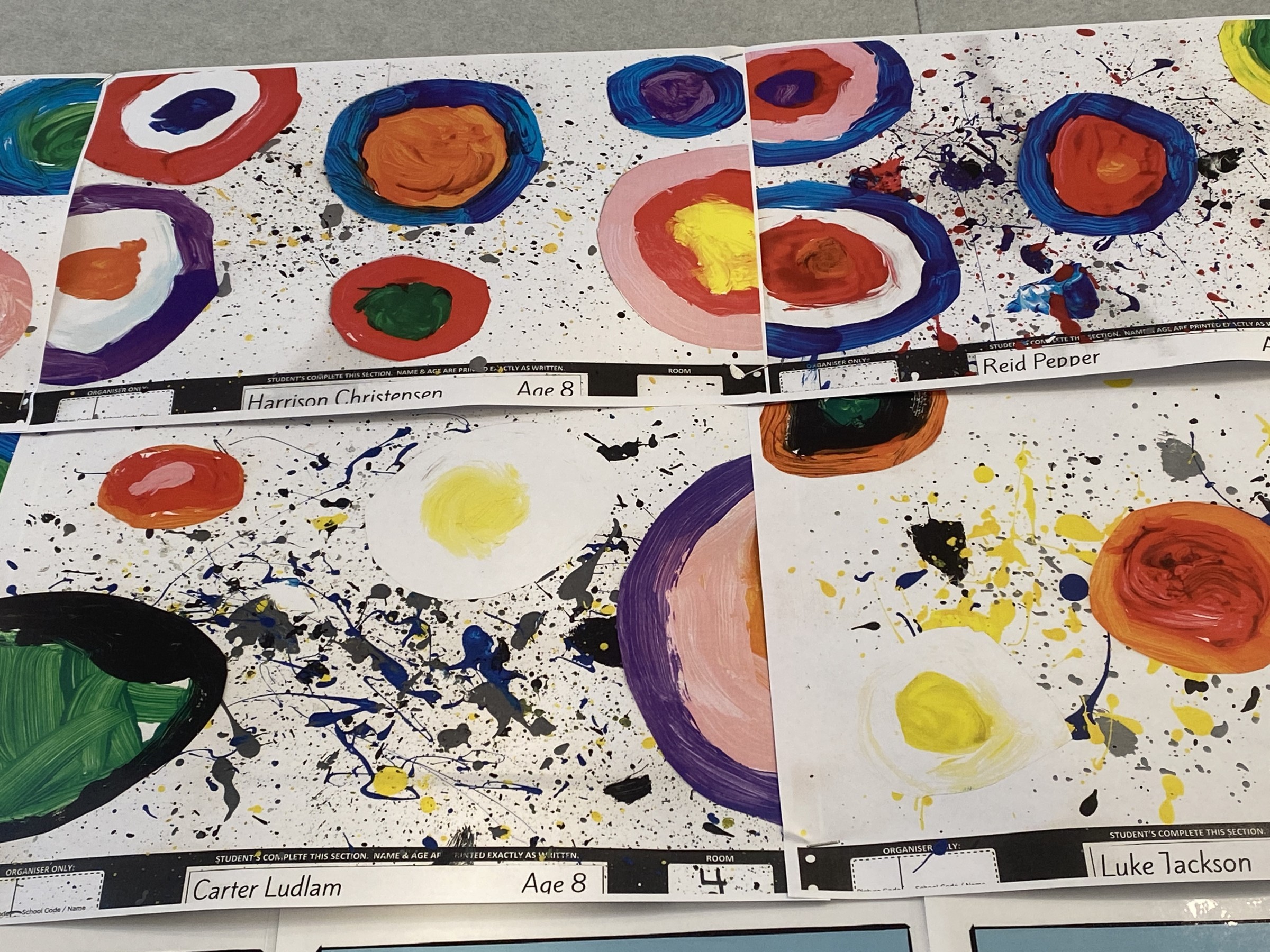
We splatter painted the background first. The next day we made circles with paint. We had to use different colours. I think it is the different designs and patterns that make our calendar art look effective.
Shape and colour art in room 1
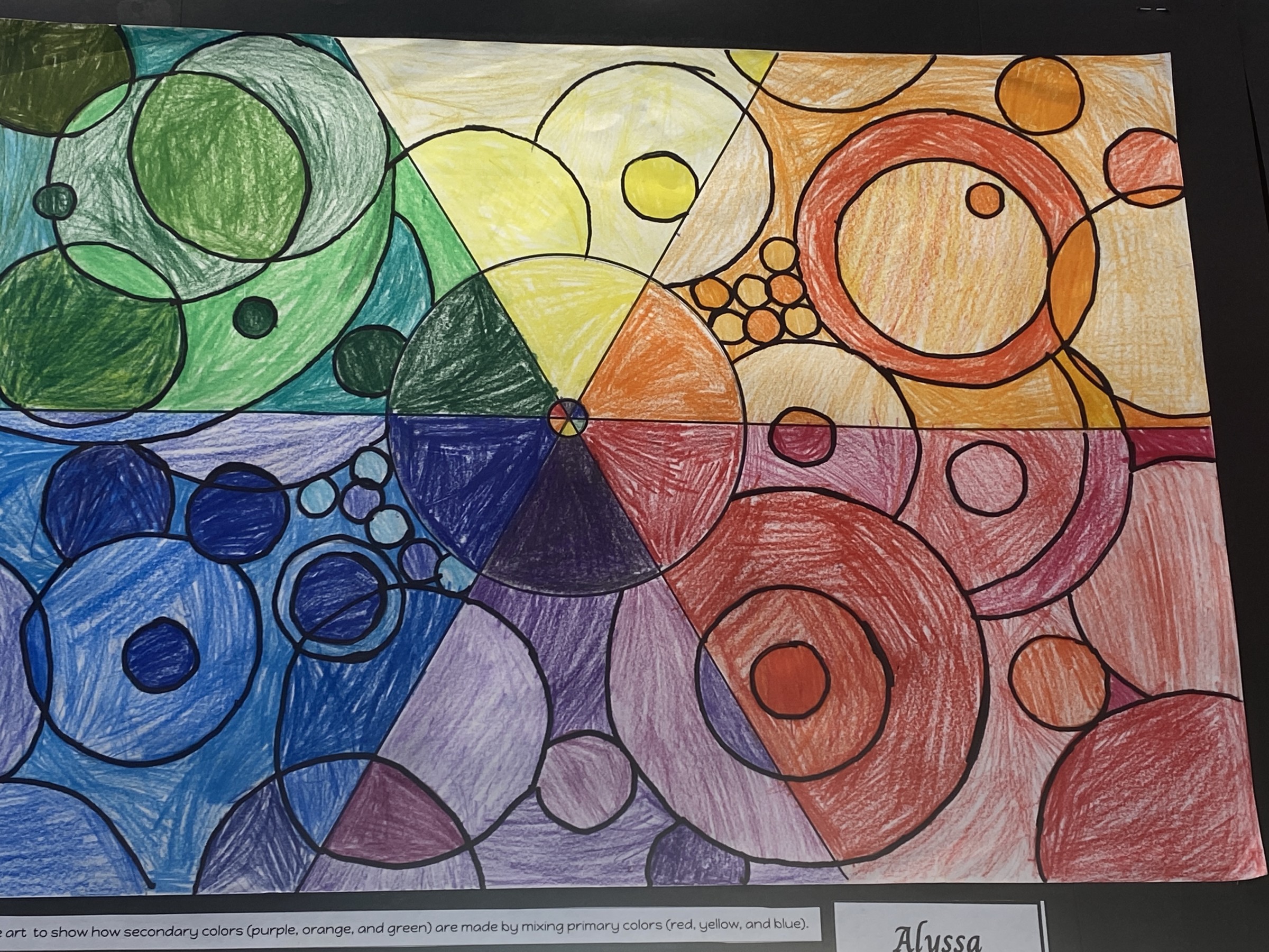
We used water colour pencils and vivids to create this artwork. In the centre of our pictures is the colour wheel. Then we shared our picture into six sections. We had to use primary and then the secondary colours from the colour wheel in the different sessions. There are different shades of the same colour. I think it is the bright colours and the repeating pattern of the circle that makes this art effective. I also like the way the circles overlap and change colour slightly .
Students will:
UNDERSTANDING THE VISUAL ARTS IN CONTEXT
-
Share ideas about how and why their own and others’ works are made and their purpose, value, and context.
Developing practical knowledge
-
Explore a variety of materials and tools and discover elements and selected principles.
Keywords: visual art, effective, art critic, colour, shape
I have been teaching since 2004. I started teaching at Wairakei Primary School in 2011. I am married to Steve and we have two children – Myles and Amelia. Myles and Amelia both enjoyed their primary school years here at Wairakei Primary School. I am really proud to be part of this school and appreciate all the amazing opportunities that are given to our children.
I like working with children and teaching. I love the fun that can be had and the feeling of being a part of a child’s growth and development. My favourite subject is maths. I appreciate the patterns and connections that can be found in numbers and I enjoy problem-solving. I have trained as a Math Specialist Teacher (MST).
My family and I love living in the Taupō area. When I’m not teaching I enjoy spending time with my family, walking my dog and mountain biking - which is a particular family passion.
Comments are disabled for this post.